Bluewing
Bluewing Design & Construction Pvt. Ltd.
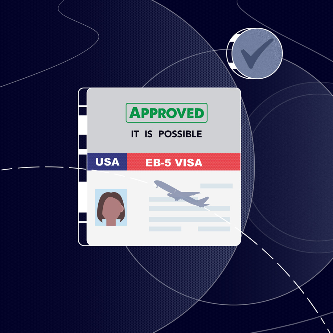
This was a very complex topic to touch upon. It was complex because we were trying to engage people in a technical financial and immigration process. We needed the visuals to really pull its weight for this one so that a technical subject can still be kept engaging. We went with the classic reliable palette and decided, we will experiment with lines and fluidity.
 Setu Overseas
 We kicked off with a deep dive into Setu Overseas to understand its tone, target audience, and core messaging. This phase involved brainstorming visual metaphors, refining the narrative arc, and aligning our creative direction with the brand's personality.

Based on the research insights, we developed key styleframes to set the visual tone. These frames helped define the color palette, character treatment, and overall aesthetic—ensuring a cohesive look before moving into animation.

With the visual language locked, we brought the story to life through 2D animation. The character, provided by the client, was animated with expressive movement and rhythm to match the energy of the brand. Smooth transitions and bold graphic elements enhanced the storytelling and made the promo film visually engaging.
Creative Direction
Style Frame Designer
Graphic Designer
Motion Graphics and Editing
Motion Graphics